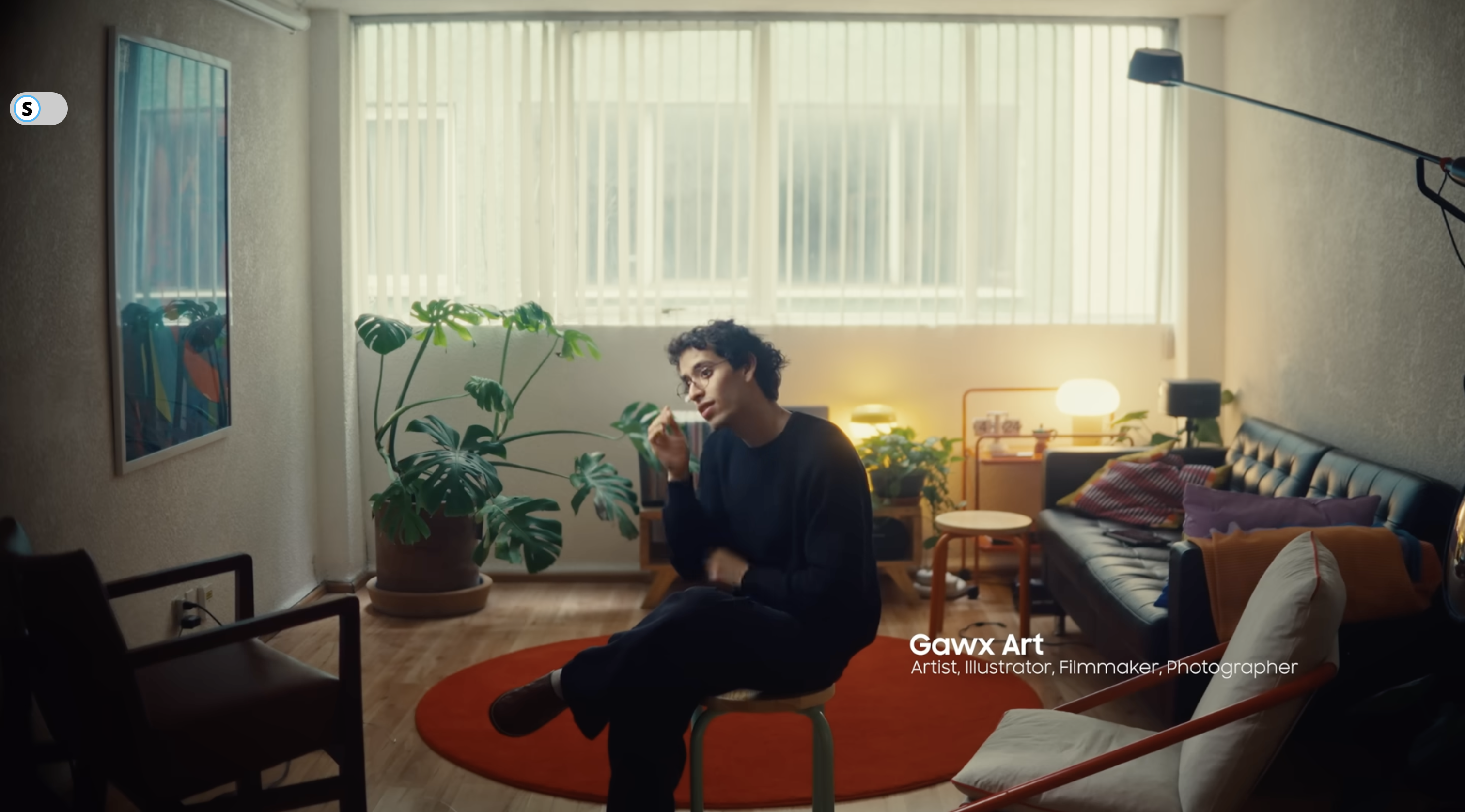
Part 1 — BTS Film
Selected Voiceover
Nine voiceover blocks forming a single narrative arc. Artist-led VO drives the film. These are Era’s words, spoken over BTS footage of her process and space.
01 The Room→
02 The Process→
03 Delhi→
04 The Small Things→
05 Colour→
06 The What If Game→
07 Indian Craft→
08 Responsibility→
09 Born Colourless
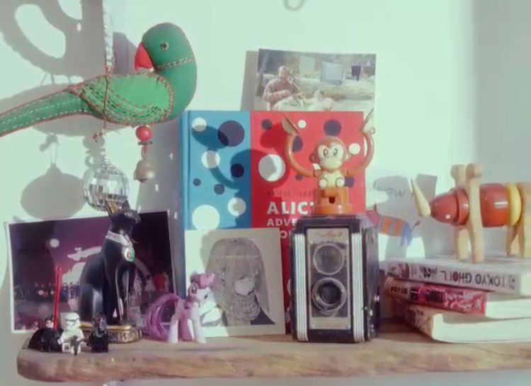
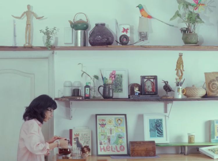
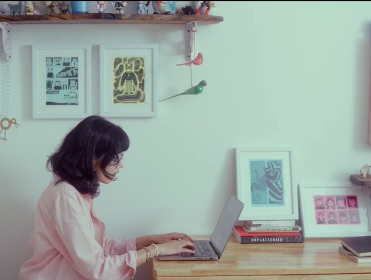
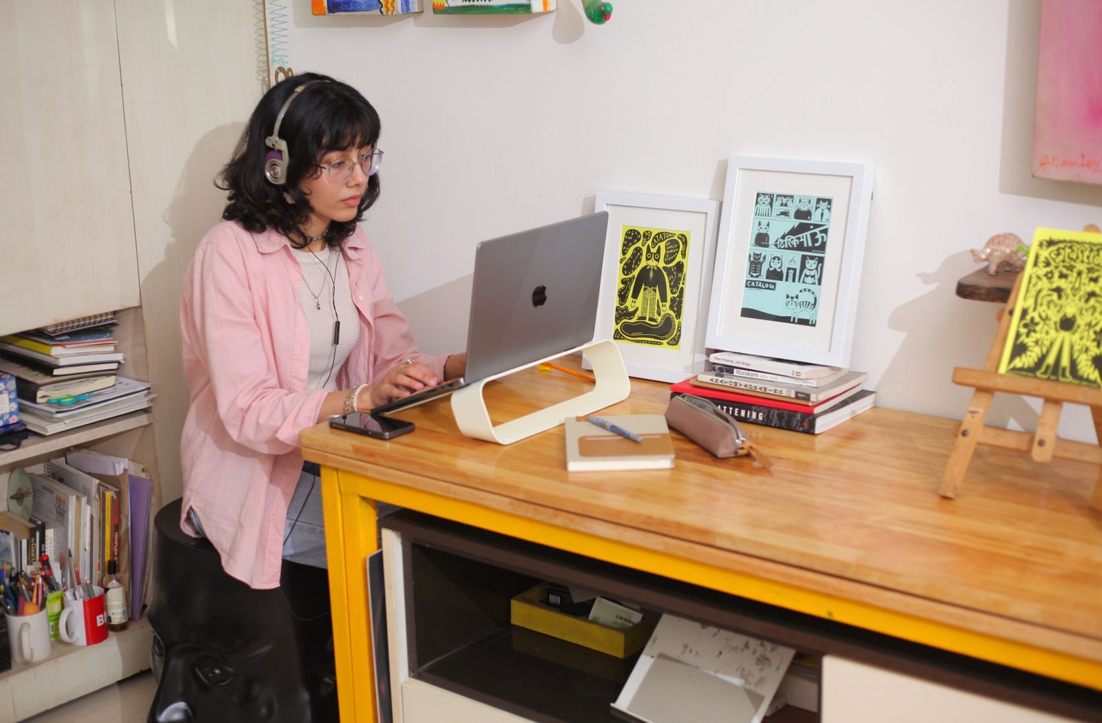
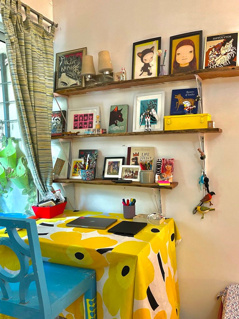
Block 01 — The Room
Reference Frames
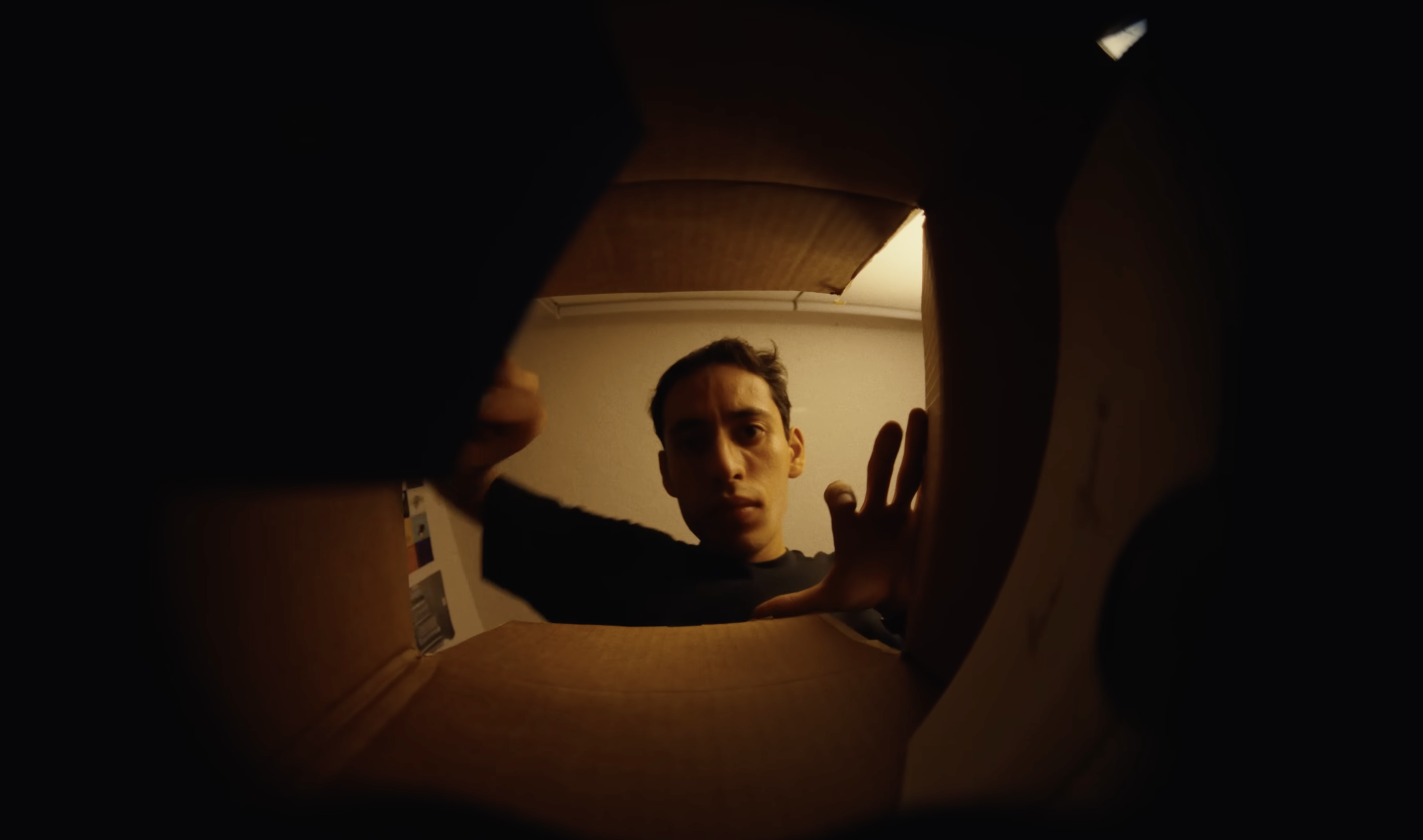
This is where it all happens…
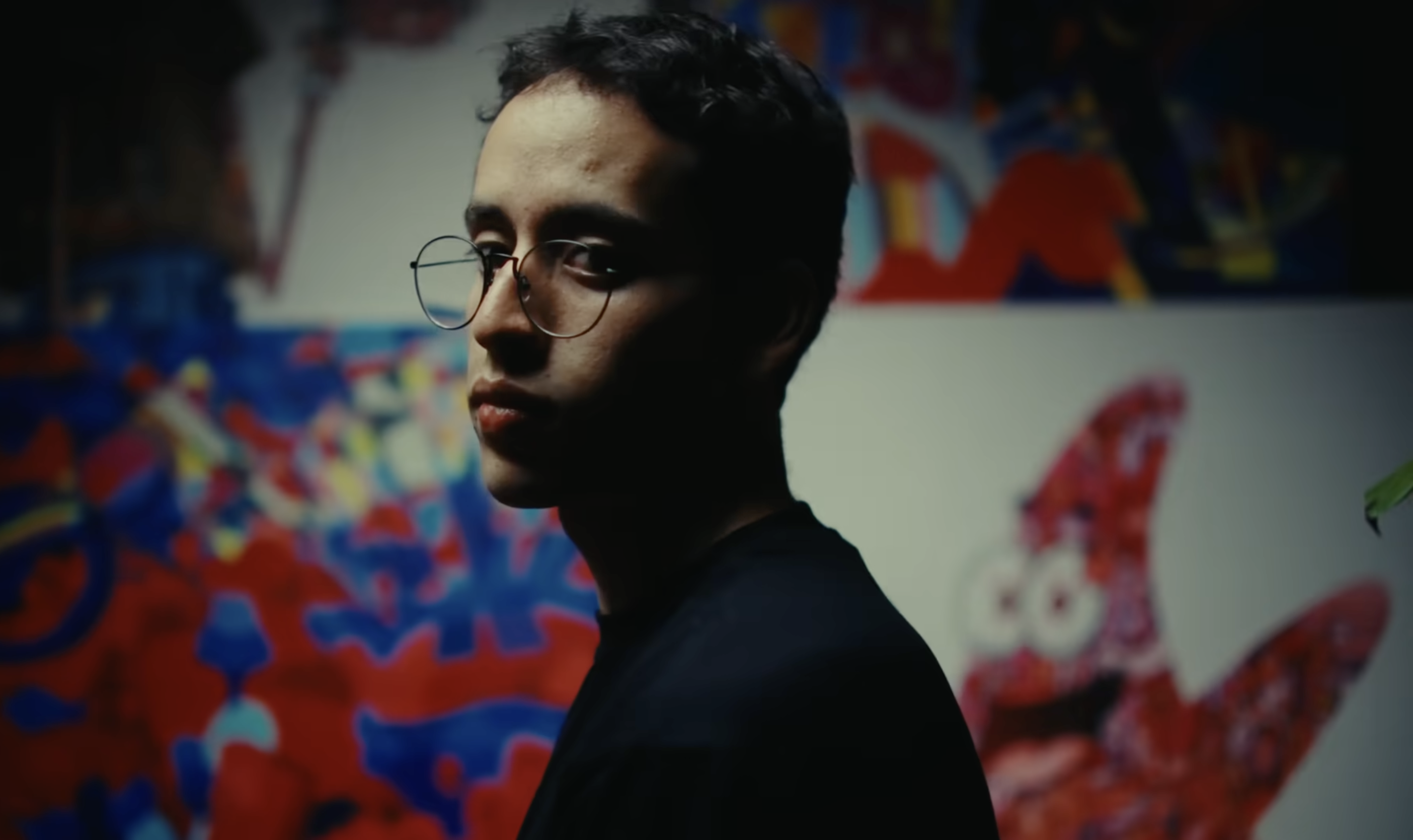
“Hi, I’m Era Namjoshi, and I’m an illustrator and visual designer. And this is where it all happens. Every object in this room carries a memory — things my parents collected, pieces gifted by close friends. The spaces I inhabit and the people in them have shaped me more than I realise. And that’s where my visual language comes from.”
Wide establishing — Era’s room. Camera pans across shelves of collected objects, desk with Marimekko tablecloth, blue chair. Warm natural window light. Soft, intimate.
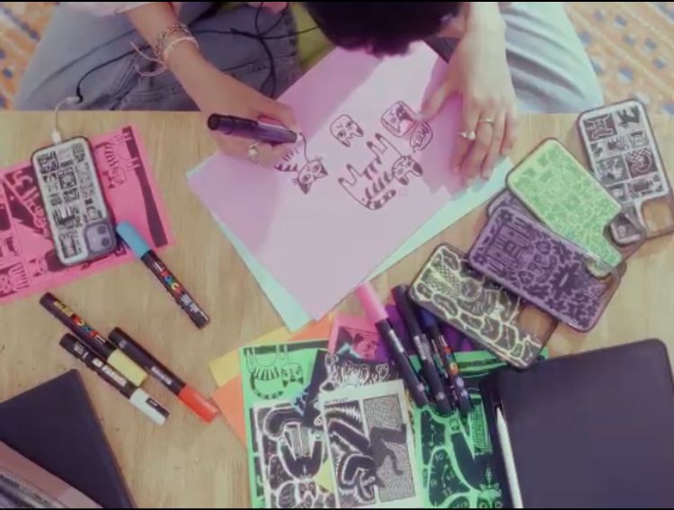
Block 02 — The Process
Reference Frames
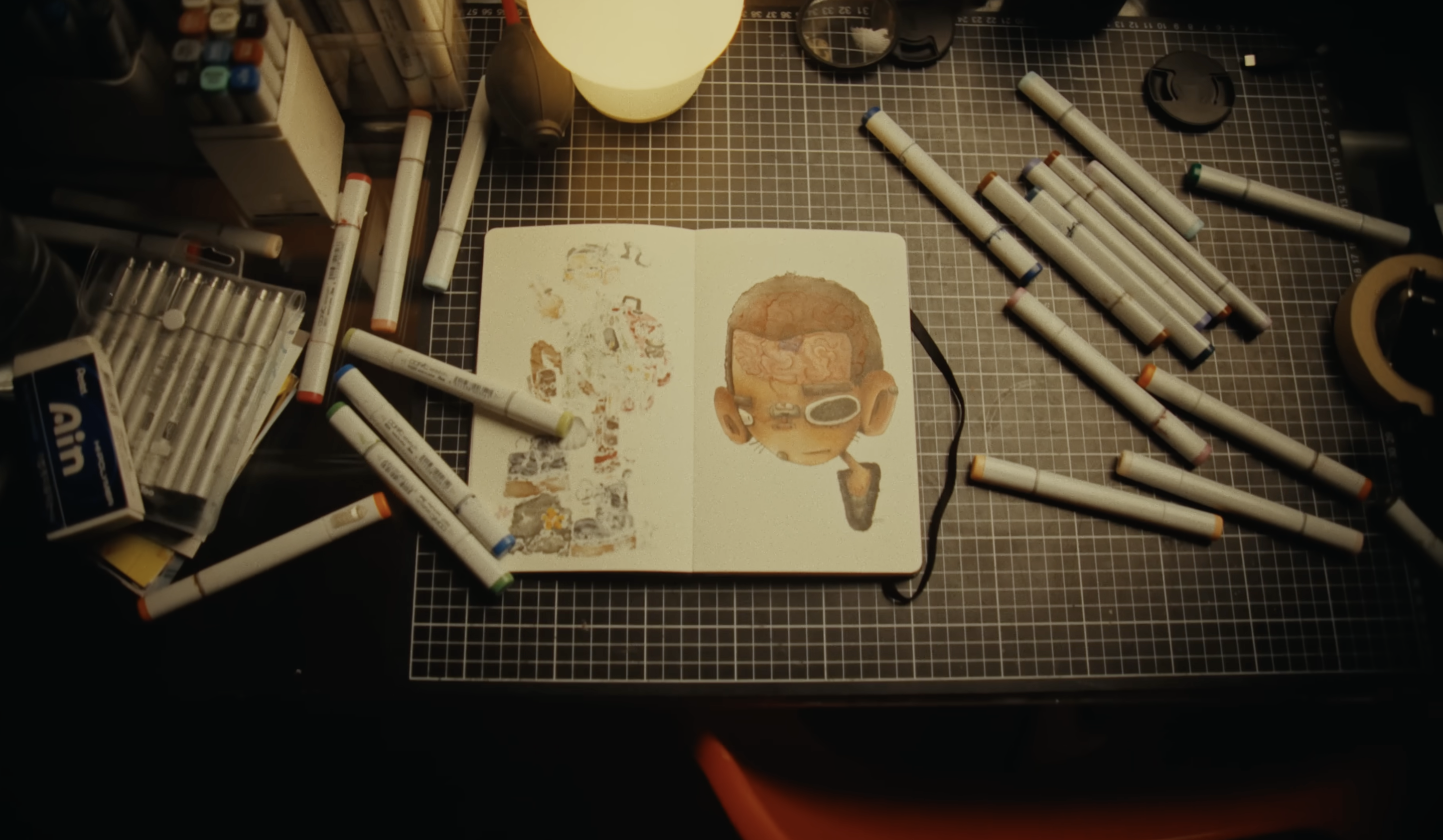
I never know what a piece will look like…
“I never know what a piece will look like when I begin. I deliberately find concepts that feel unfamiliar, and then I let the process guide me. The final piece reveals itself somewhere along the way.”
Detail shots — hands holding Posca markers, drawing on paper. Close-up of bold shapes emerging. Rack focus between marker tip and developing illustration.
Block 03 — Delhi
Delhi is chaotic…
“Delhi is chaotic. But somehow everything finds its place. It’s also such a cultural melting pot. I’m constantly absorbing new things — languages, textures, people. All of it finds its way into the work, whether I plan it or not.”
Cutaway options — Delhi street textures, colour palettes from markets. Or stay inside: Era looking out the window, city sounds filtering in. The outside world entering her work.
Block 04 — The Small Things
Reference Frames
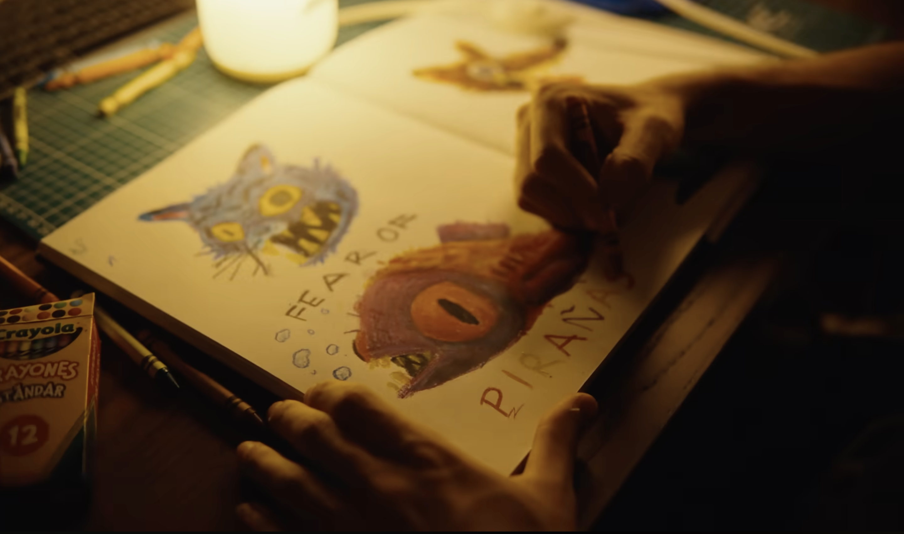
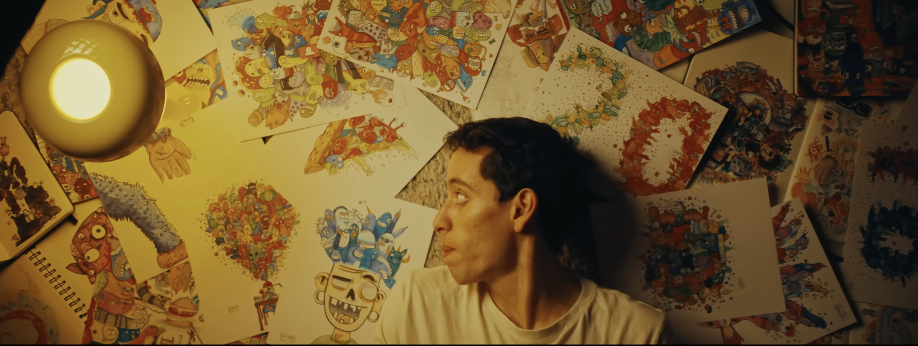
I’m drawn to small, peculiar details…
“I’m drawn to small, peculiar details. A strange haircut. An oddly specific dog posture. Patterns of dust and scratches on glasses during an eye test. Things that don’t matter in a larger sense, but feel important to document.”
Extreme close-ups of objects on Era’s desk and shelves. Small curiosities. Shallow DOF. Her eyes noticing details. The camera mimicking her gaze — finding the small, the peculiar.
Block 05 — Colour
For most of school and college…
“For most of school and college, I worked almost entirely in black and white. Then after COVID, colour just took over. I think I replaced the white with colour and kept everything else. The black was always going to stay.”
Split visual — black and white sketches on one side, then explosion of colour as she adds Posca marker strokes. The transition from monochrome to polychrome. Bold, graphic.
Block 06 — The What If Game
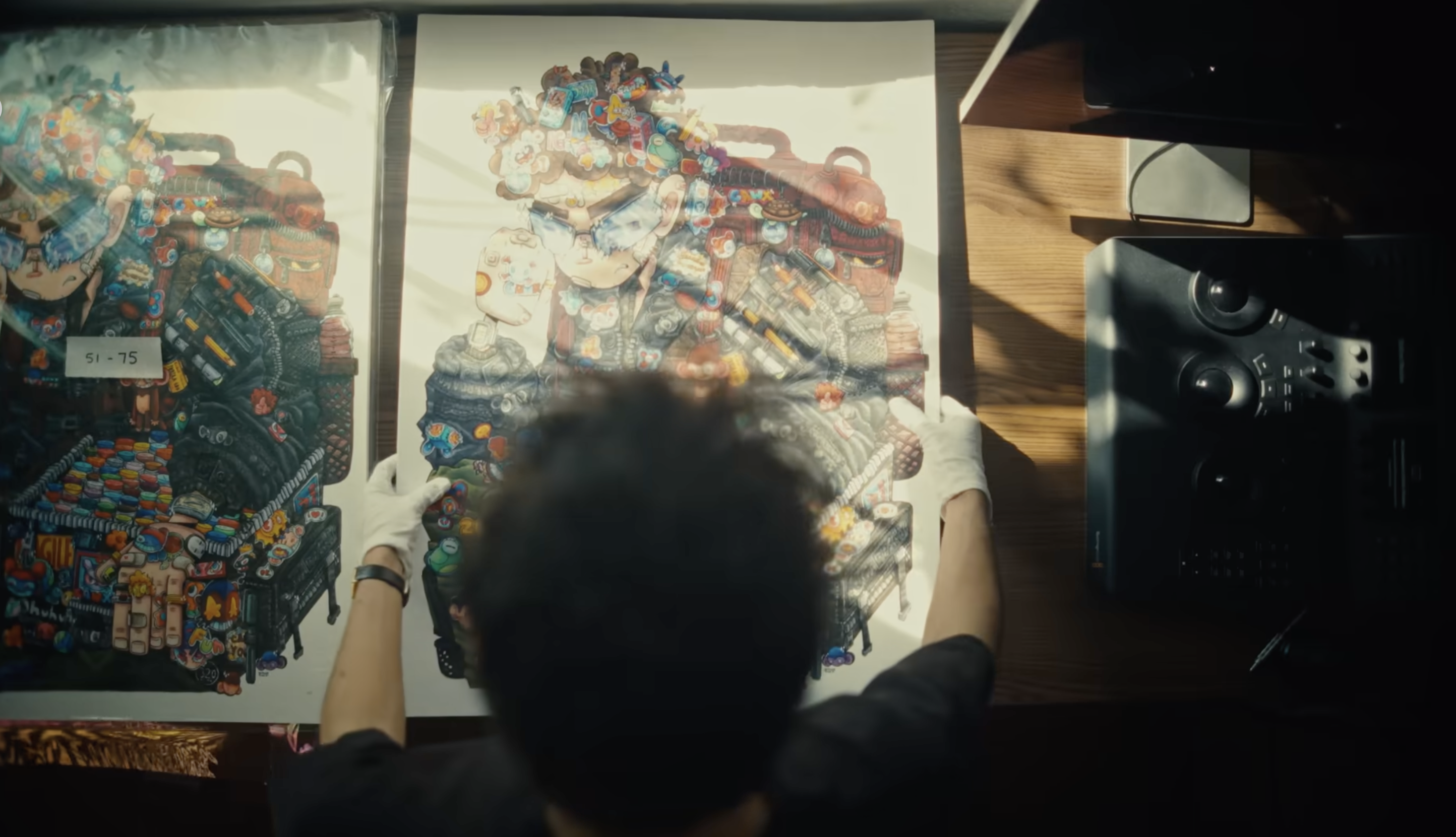
When I’m bored, I play a game…
“When I’m bored, I play a game. What if a cat was a spider? What if a duck wore a tuxedo? What if there were trapeze-artist cats in a circus? If something excites me enough, I write it down — and then I draw it.”
Era flipping through sketchbook pages. Camera catches surreal illustrations — animal hybrids, impossible scenarios. Her handwriting. Quick cuts between sketches. Playful energy.
Block 07 — Indian Craft
I’m deeply inspired by India’s craft traditions…
“I’m deeply inspired by India’s craft traditions. Dhokra, Gond art, Kathputli puppetry, leather shadow puppets. There’s something in their playfulness and storytelling that I keep coming back to.”
Close-ups of Indian craft objects in Era’s collection (if present). Or detail shots of her illustrations that reference these traditions. The visual link between heritage and her contemporary work.
Block 08 — Responsibility
I once worked on a project about violence against children…
“I once worked on a project about violence against children. Representing that literally felt wrong. I had to rely entirely on metaphor and symbolism. That project deeply shifted my understanding of responsibility in visual storytelling.”
Slower pace. Era working carefully, making deliberate choices. The weight of subject matter visible in her concentration. Tight on hands, then pull back to her face. Contemplative silence.
Block 09 — Born Colourless
Born colourless…
“To me, Born Colourless means starting as yourself — without labels, without expectations — and gradually adding your own colours to the world. But at the same time we’re never truly colourless — our experiences and environments shape us constantly. The meaning evolved for me. It became less about absence, and more about becoming.”
Final piece appearing under her hands. Pull back to full room. Era leaning back, looking at what she’s made. Hold. Window light shifting. Colour everywhere. End.